Saturday, June 28, 2014

Feature Illustrator: Marc Boutavant

Marc Boutavant (award-winning author and illustrator)

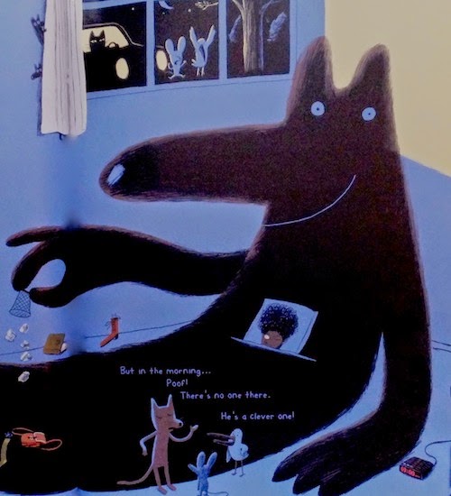
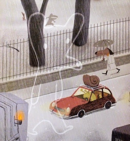
I first found out about Marc Boutavant through his graphic/comic book, "Ariol", which Julia (my eight year old) pulled out from the library's book shelf. I find his illustration style refreshing, delightful and unique. He has created a whole world of believable (and cute) characters which are lively and expressive, and very distinctly rendered in his illustration style. His ideas for unique characters appear to be endless.

I absolutely love his colors - bright and attractive but not too distracting and overwhelming. They say he mainly uses Photoshop and works on a graphic tablet, quite amazing given the excellent texture and fluidity of his line work. His illustrations are seemingly simple but are actually complex, in my opinion. He is one of the illustrators whose work I really admire. Attending one of his workshops is definitely in my dreamlist.


His agent's website has this to say about him:

"Originating from Burgundy (as do the best snails in France - according to Marc), he now lives and works in Paris. WIth his appreciation of the finer things in life, he has often been described as the archetypal French man (even by French people).

His work springs from a wry observation of life and the interaction of his friends and children. Their quirks of personality, mannerisms and reactions to situations are transported onto his characters. These are creatures with a full gamut of emotions. The adventures they share become the narrative tableau for this cast of companions. With so much activity in every corner, each scenario felt and imagined in detail, light hearted horror, comedy and pathos combine to form a rich narrative." 

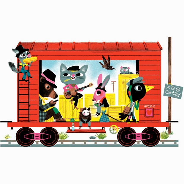
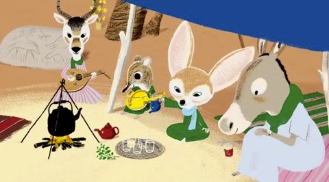
Here are more images of his work:


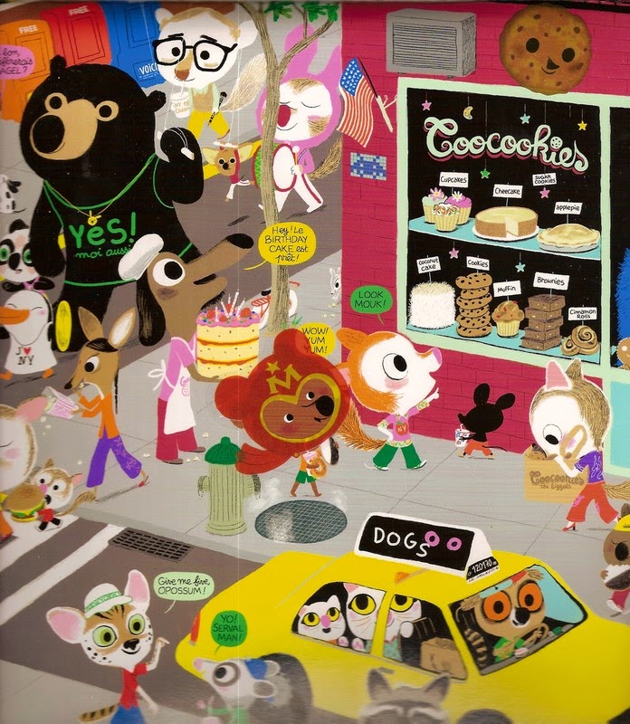
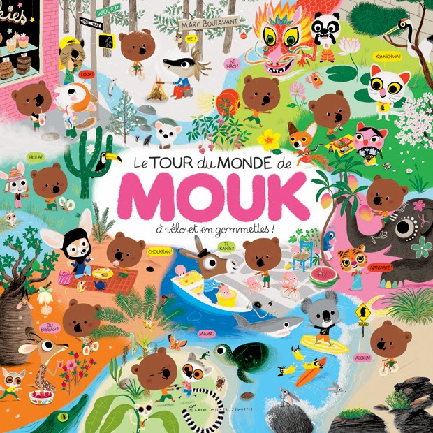
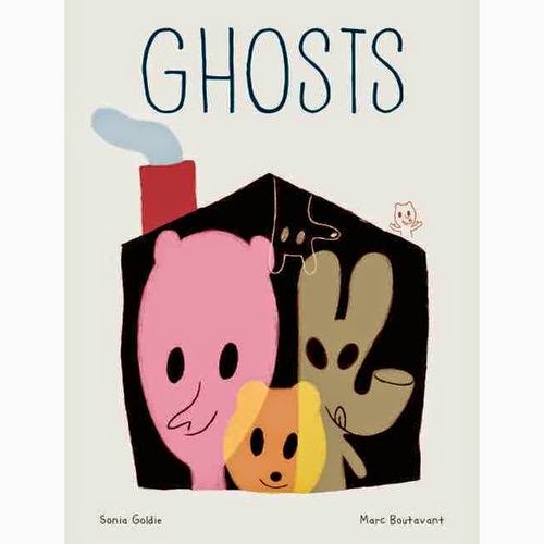
His books are mostly in French and English. His popular English books include Around the World with Mouk, Ariol series and Just for One Day. Both Mouk and Ariol have been adapted into animated tv series. His most recent book titled, "Ghosts" is written by Sonia Goldie.


He is represented by Heart Agency. Click here for more images:  http://www.heartagency.com/artist/MarcBoutavant/gallery/1

Saturday, June 21, 2014

Realism and Representation

Beatrix Potter once wrote," I can't invent, I only copy". By this she meant that she painted what she saw. While her children's book illustrations had animal characters dressed up as humans, her style still leaned towards the near realistic portrayal of her subjects.

I had grown up learning to copy objects (or sceneries) as much as possible. The two summer art teachers I had were both classical watercolorists. I remember them reminding me that with watercolors, it was all about the light, paying very close attention to where the light is and the shadows are. I needed to master that if I wanted to make my paintings look more realistic. Colored pencils I find, is an excellent medium for making realistic drawings. It allows a more precise depiction of details as seen in my drawing of a woman below.

Woman done in colored pencils
With children illustrations however, it is entirely different. I've looked at a lot of children's book illustrations and found myself preferring those illustrations which are more representational and symbolic. Seeing very realistic illustrations on children's books somehow lessens the excitement for me. With children's illustrations, it has less to do with how accurately the illustration depicts the real thing than the fact that it conveys the idea and "feel" of the real thing. Often, simple lines and shapes would do. The imagination does the rest. That's what I believe anyway.

Below is a drawing of our cat done by my 8 year old daughter. The next one is my sketch of the same cat. Totally different styles, with mine closer to looking like a real cat than hers. Personally, I like her drawing better, its more fun and effective in portraying the cat's character in a few lines and simple shapes. Maybe this is how they see the world. They absorb and convey the essence of the character with just the key features being represented.

Drawing done by my eight year old

Pen sketch of our cat

It is this challenge of capturing the essence of the animal or imaginary character in as much simplicity as I can that I find exciting and difficult at the same time. It is almost as if I need to overhaul the way I see the world as an adult and put on the child's eyes that I use to have (or that my kid has). Either that or I let my hand run without my head. On this latter one, I find the brush and black ink a very helpful medium in freeing one's tight grip on reality.

Racoon and gang quick sketch in brush and ink

Monday, June 16, 2014

Discovering Gouache

Three reasons why I have not tried gouache before are: 1) it wasn't a popular medium which was probably why it wasn't available in the place I used to live in, 2) I didn't know anyone using it, and 3) it felt to me like a complicated medium with a complicated name. 

But I did end up trying it because I was looking for a medium that was more opaque than watercolor but wasn't as shiny (and as sticky) as acrylic paint. Plus, one article I've read mentioned that with gouache, your brushstrokes wouldn't show. Really? I had to try that!

I promptly went to the art shop and asked if they had "gowch". The kind personnel smiled and said, "You mean "gwash"? It turned out that gouache, the really nice brand that is, don't come cheap and is sold at about $7.00 CDN each for a 20 ml tube. So I decided to buy the cheaper brand (Reeves) which was at $17.55 a set (24 tubes of different colors!) and then got 4 of the more pricey ones (Acryla) brand for the bright colors which weren't in the set. I also got a white tube by "Grahame & Co" because it was on sale and I knew that with opaque colors, I needed a bigger tube of white.


It turned out that like most things, I get what I pay for. I now firmly believe that when it comes to paint, I shouldn't be buying the cheaper ones. I found that the cheap "Reeves" gouache was powdery when dry, colors were dull and after mixing them, they turned to "mud" very easily. I found it very hard to get the right hues and contrast and ended up mixing it with acrylic paints to pump the colors up. Lesson 1: I will never buy cheap gouache paints..ever.

Then I found another thing. Lesson 2: There are two kinds of gouache paints. (Who knew?) One was the basic gouache which works like watercolors -  when you put another layer of paint over a previously dried layer, the two layers would mix. And then there's the second type which is the acrylic based gouache, which works like acrylic in that once it dries, it wouldn't mix with the next layer on top of it.

I soon found out that the four pricier ones that I had bought were acrylic based gouache, which I liked very much owing to their bright colors and creamy consistency and the cheaper ones plus the single white tube on sale was the basic gouache. Nevertheless, while I'm saving to buy more Acryla gouache colors, I'll be using the basic gouache in the meantime and mixing them up with my acrylic paints. 

The below illustrations are the result of my gouache experiment. This is about the moment of discovery. When a child discovers something that had been until that moment only in her imagination. I have always loved the idea of little people, starting with those tiny creatures living on the windowsill in Sesame Street. I wasn't too sure about the wings on this one but thought it would look better with the whites breaking the monotony of the greens.

Well, I don't know if it's because of the brand of gouache I used or because I'm mixing it with acrylic, but my brushstrokes are still showing. 

Starting to color the pencil sketch

Adding contrasts among the greens

Finish work on watercolor paper

Saturday, June 7, 2014

Outlining Watercolors


What I like about watercolors, aside from the fact that it is odorless (ideal for people with asthma like me) is the watermark that it leaves on paper when it dries.With acrylic paints, its mostly the brushstrokes that shows which often feels heavy for me. With watercolors, there's a tiny bit of serendipity in play and I look forward to being surprised at what the water does to the paint as it flows. I love the natural lightness to it too.  

But what I find challenging with watercolors is that it's sometimes hard to make the outlines distinctive.I often find myself painting over the dark areas a couple of times to achieve the contrast that I like and then I end up painting over the other areas to match the now darker areas which then messes up the lovely watermarks from the initial underpaint.

So recently, I tried using ink to outline and emphasize the darker areas. I do find that I get the best results if I don't ink it all. I leave some areas without the black ink outline and just ink in the areas where I'd like the details to show. In this way, by not outlining all edges, I get to veer away from having my painting look like a comic strip (as what usually happens with ink drawings) and have it look more fluid and lighter. What do you think?


Tuesday, June 3, 2014

The Storyteller

Well, hello there! It's nice to meet you. 
You came in just in time, the fire is crackling nice and warm,
everyone have gathered around and the storyteller is about to begin his tale.
After all, stories are what connects us. 
Their embers make us glow from within.
Let the journey of discovery and adventure continue.
And as with all great journeys, it begins with one step.