Monday, December 15, 2014

All About Ink (Part 2)

I've read somewhere that an artist's style is not something one has to learn from the outside to figure out. The flow of the process isn't about absorbing what is out there and finding which ones fit us but rather the opposite, letting what is in us come out for the outside world to absorb. The article said it in a simpler way but this is how it got stuck on my head. And for me, it is a source of inspiration - the thought that it (my artistic style, in this case) is already in me and all I needed to do was to let it out. And, this is the best part, because it is in me, try as I might, I cannot escape it. So no matter how much I try to draw or paint or copy an object or someone's work, it would never come out the same as the object being copied. It will always come out in the style that is inherently mine. Now, isn't that a great and inspiring thought?

My work therefore isn't on "finding" what my style is, as if it is lost out there wandering in the deep artistic woods, but is on me allowing that part of myself to be released and expressed. It is already here, within me. All I need to do is clear the way. This way of thinking had profoundly changed the way I see my creative journey.

Before I joined inktober, I admit, I wasn't a big fan of pen and ink. Mainly because I love colors and black and white felt too constrained for me. However, participating in inktober have definitely changed that. I now see pen and ink as an ideal medium for exploring the essential elements and foundations of an artist's style. Because it is a very simple medium, only a paper and black ink to work with, I was forced to work at the other elements in my drawings that otherwise I wouldn't have thought much about.

Black ink has a very fixed characteristic in that it is always black. There is no grey with black ink, so how do I create texture and tonal values with it? I found myself simplifying my drawings and putting in a greater focus on my line work. It made me consciously think about my shadows and lights and the negative and the positive ways of making an image. And because I could no longer hide behind vibrant colors or under the inherent water textures of my watercolors, my linework, composition and harmony in shapes needed to be brought to a higher level. Things needed to be simplified even as the expectations of producing a dynamic and expressive artwork remains the same.

The below inktober drawings are my favorites. In each drawing, I could see a part of my style starting to come out in different ways. I usually mull over an idea the moment I wake up every morning and by the time I need to execute it in the evening (with much trepidation), the idea and its elements are already stuck on my mind. It is then just a matter of copying the picture in my head. Not having worked with pen and ink before, I was surprised at how the medium could quickly render an idea into something that looks quite definite like it just came out from the printing press (after hours and hours of hard labour). Pen and ink, in my opinion, is one of the easiest and fulfilling mediums I've gotten to work with.


Monday, November 3, 2014

All About Ink (Part 1)


Last October I participated in the Inktober drawing challenge in which artists draw one ink drawing a day for the whole month and then post them on social media hatshtagged  #inktober. The goal is to improve one's inking skills and develop positive drawing habits.  For more details, here is Jake Parker's (the founder of the challenge) website. http://mrjakeparker.com/inktober

It's my first time joining an online challenge of any kind and now after doing it for the whole month, I could say I've thoroughly enjoyed it and have developed a positive attitude (and habit) on my drawing. I must admit, I am not an inker to start with. I do use the ink brush occasionally for quick character sketches but haven't really done much more. So my goal in joining Inktober was to get from level zero to level 1 in my inking skills. Of course, there were days when I questioned the sanity of doing it specially when all I wanted was to sleep after having a very tiring day or days where I was tempted to skip because I did have valid reasons, right? (so I tell myself). So I was honestly surprised that I was able to ink every day, rain or shine, grumbling or smiling, awake or semi-awake. If anything, I am proud of myself for being able to show up on the blank page every night, facing my doubts, battling my fears and pushing that ink brush around like a wand dispelling all these monsters away. This is probably why I'm happy with my inktober experience. And this feeling is what I will take with me when I am faced with another blank page battle in the future. "I can ink you! Yaaaaghh!" is my running battle cry.
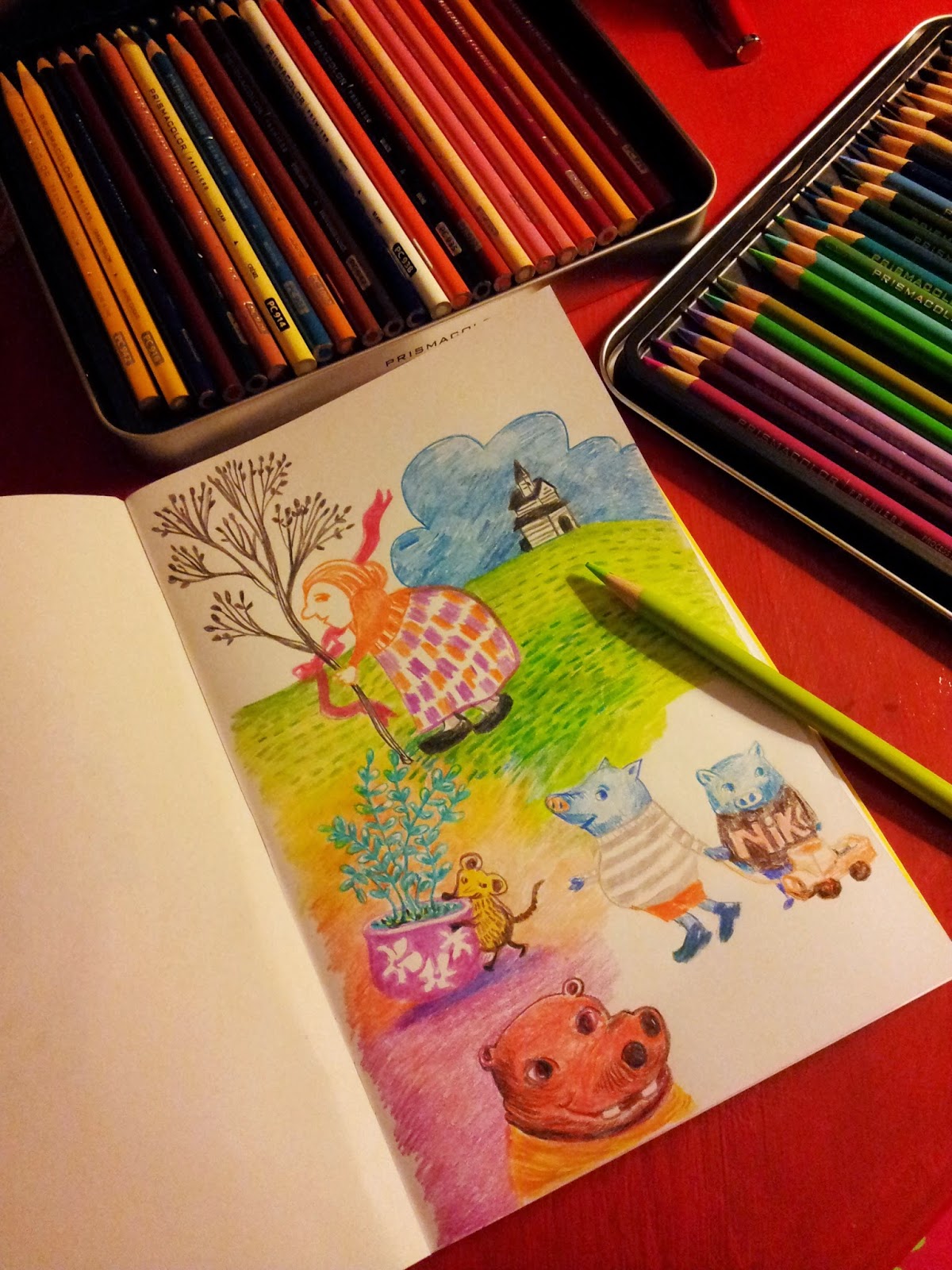
Tools:
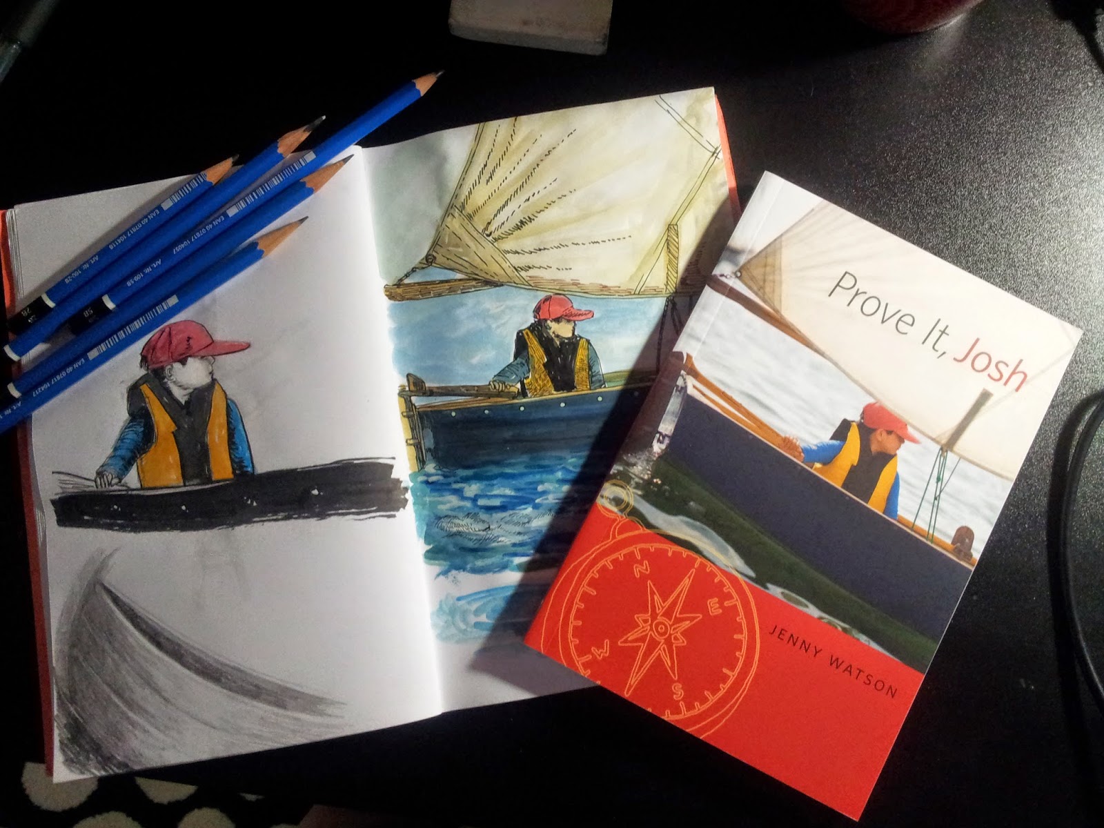
I gathered my tools (below), all of them except for the Pentel Pocket brush are old pens I've collected over the years (and barely used). I bought the Pentel pocket brush specially for inktober as I've read good reviews about it from an artist's website (I can't remember who it was anymore, maybe it was from the artist, Will Terry) and thought I'd try it. It is pretty pricey considering there's the cheaper Micron brush pen and the bigger Pentel color brushes available as well. But as I later found out, it was totally worth it. I found the Micron brush pen too short, so while it could go to a fine point with it's smaller tip, I found the degree of control I have on it was limited. The Pentel color brush on the other hand, was a bit too big and clunky. It was harder to get it's tip to produce fine lines. It was useful though for covering wide spaces. The Pentel pocket brush, in my opinion, is the best option out there as it offers a very fine point, great control, and is more sensitive to pressure so I could easily change the line width from thin to thick smoothly. The only disadvantage I find with using the pen ink brushes in general is that you couldn't do the dry brush technique with them (unless they are running out of ink). For dry brushing, sable brushes work best. I use the Windsor & Newton's #2 watercolor brush and any water-resistant black ink available.

From Left: eraser, Staedler pencil, white gel pen, micron pen, Pentel pocket brush (my favorite), Pentel color brush, Rotring Art pen (extra fine)
Paper:
And this is where I'd say, it is hugely important to choose your tools well because the tool you use greatly influences the results of your drawing. I didn't choose my paper well this time. I used a bunch of ordinary stapled bond paper booklet for my ink illustrations which at the start were great but as I got into trying more techniques, I found its limitations irritating (e.g., the ink blots so it was hard inking the tiny eyes without obliterating the white space in the eyeballs, it could take a limited number of pencil erasures before it gets too thin and would have holes). I did get through and finished the whole booklet about a week before the end of Inktober and had gotten to move on using a decent fabriano watercolor paper to ink on. And oh glory, what a difference the paper made! The ink made its mark beautifully on its surface, it had very distinct edges, the pencil marks erased well, I didn't have to worry about blotting and paper holes, and even the texture was an added delight. I would definitely be using this paper or similar papers for ink like Bristol, for next year's inktober.

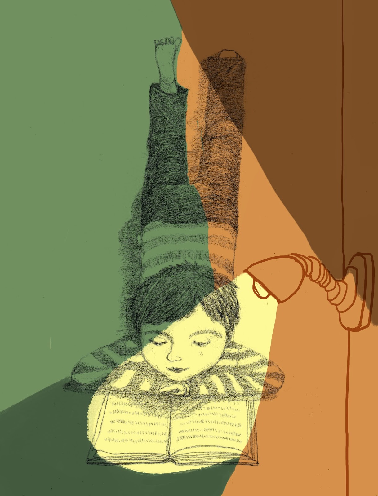
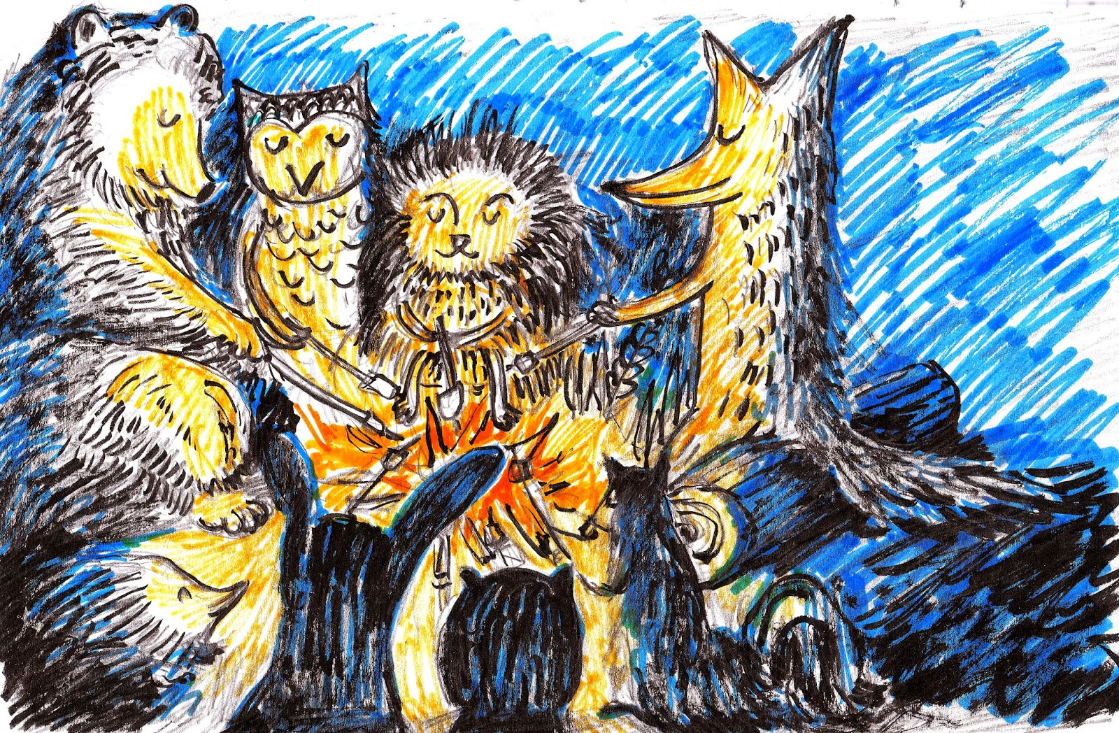
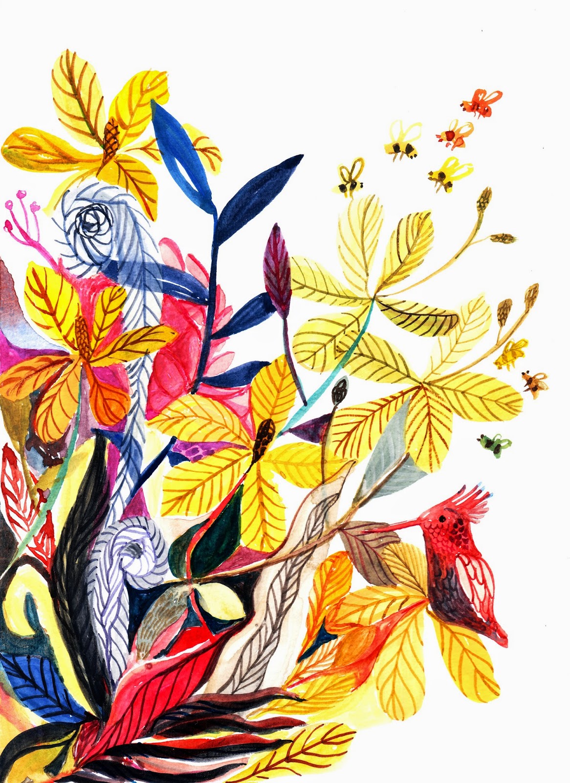
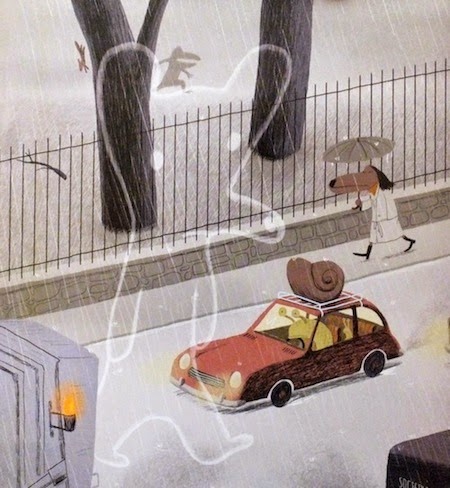
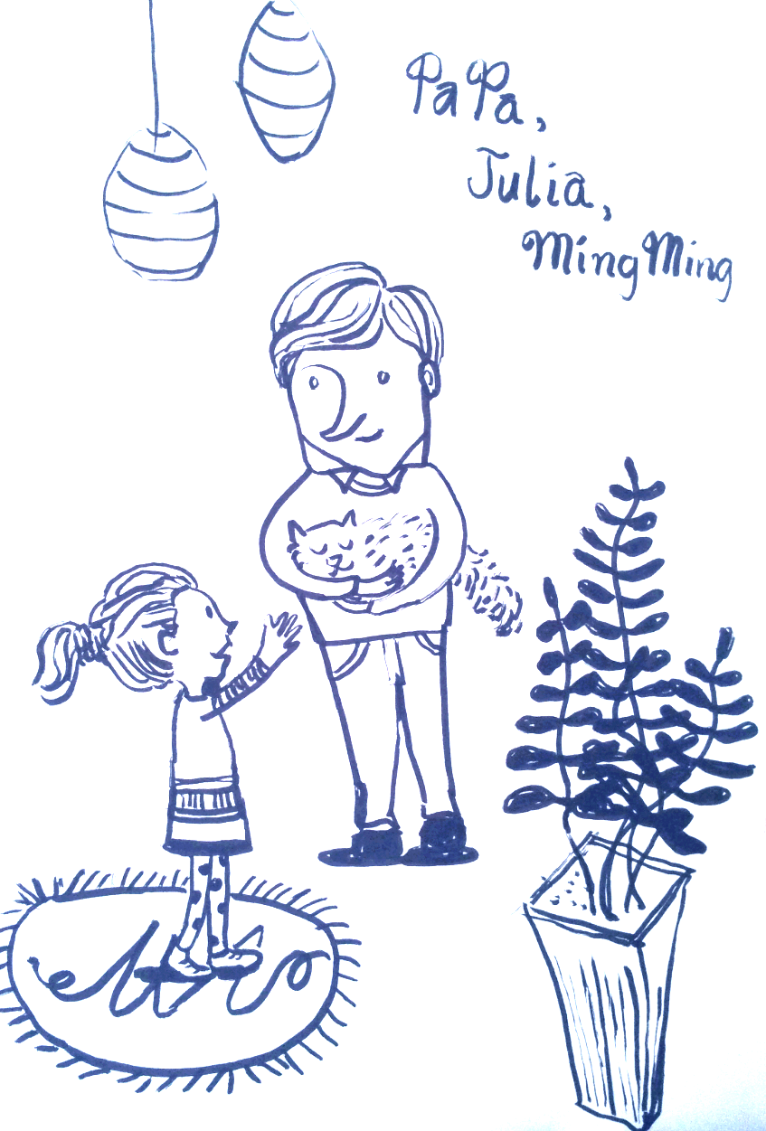
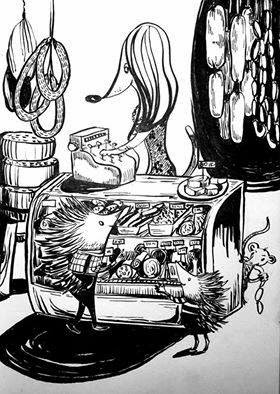
And so this was my very first sketch below. At that time, I was quite pleased with it. It looked decent considering I did it on the fly, no initial pencil sketch or anything. Just spontaneous inking on the page. I used the Pentel color brush, took a picture of the drawing using my phone and then changed the black ink color to blue using the phone app. I thought I captured Julia's and Mingming's expressions well and was glad I add the touch of the plant on it that provided some texture.


First Inktober drawing

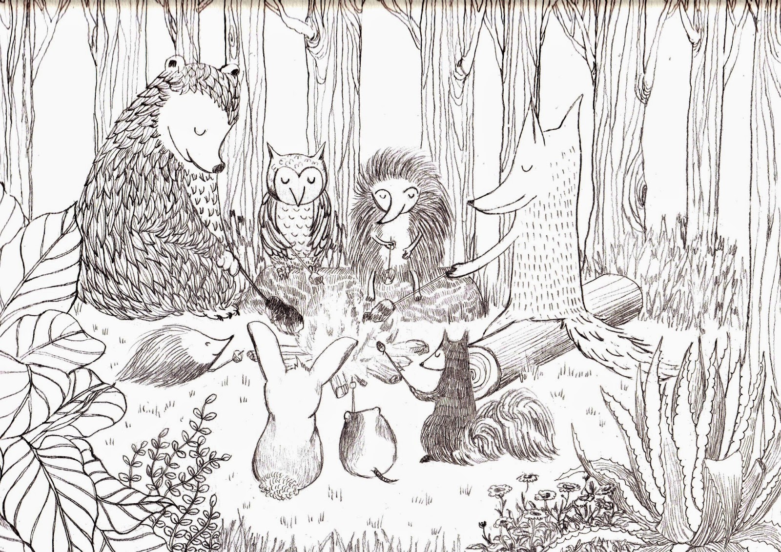
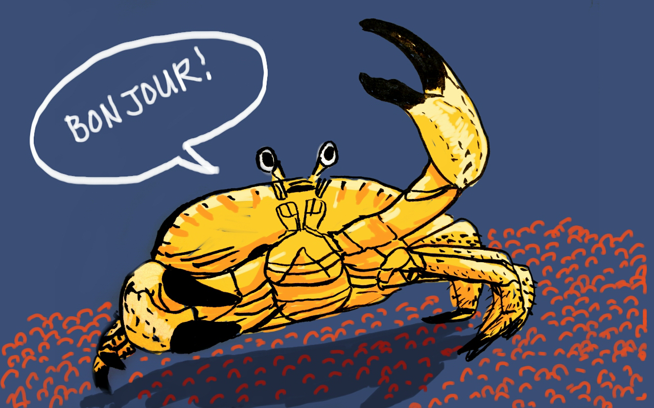
In one of my next ink drawings, I experimented mixing the broad brush strokes with the smaller linear strokes of the art pen. Doing this one, I realized that I love inking the details of textiles and clothing. Not only does it add to the character, visually, it adds contrast and texture. While doing this, I remembered the works of Japanese and Chinese artists who are masters at painting with ink brushes and proceeded to do some research. There were a lot of magnificent works online. One of the modern artists I found, whose works I like and admire is Yuko Shimizu. (http://yukoart.com/category/work/)
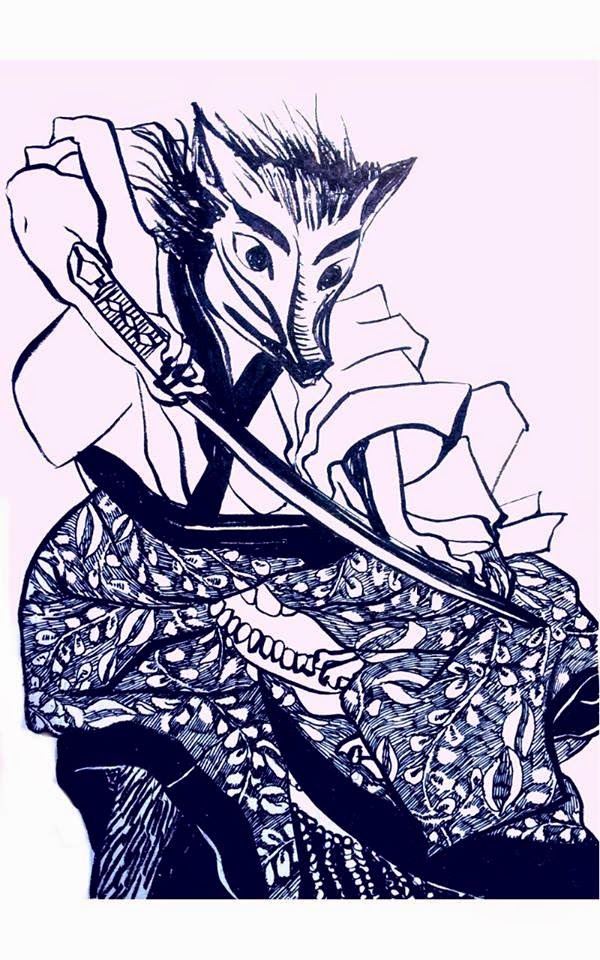
Fox Samurai

Not all successful and talented artists have the added bonus of being prolific on social media. Yuko is quite generous in sharing her work, process and thoughts. That's one of the things I like about her. She has a blog and facebook account where she shares her thoughts frequently. Yuko works with a special Japanese brush (she had shipped from Japan) and uses Dr. Ph Martin's black ink exclusively. She works in ink and then colors it in photoshop. Her ink work is amazing. Just look at those textures! It is complex and simple at the same time. I love how she tackles the details of different materials (i.e., water, wool, hair, metal etc.). From looking at her works, I learned the value of using the dry brush technique and the use of negative space. There is a sense of "fluidity" in her strokes, which I suspect would only come when one had done a whole lot of inking like she did. Amateur inkers like me could learn a lot from studying her work.

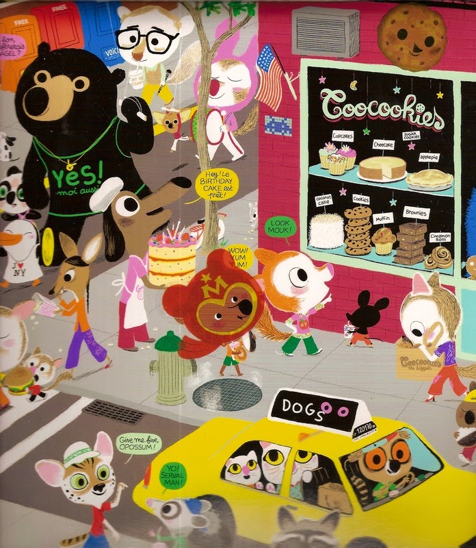
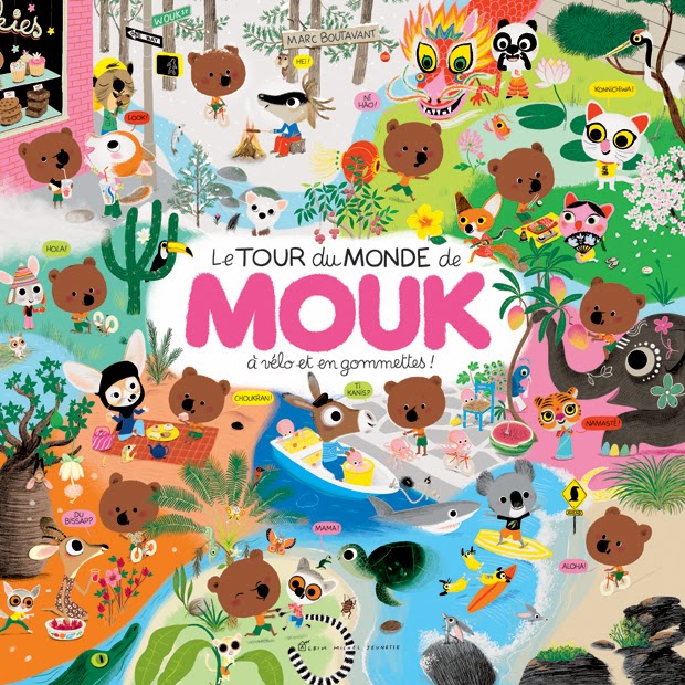
Below are two samples of her vast work:


The Wild Wild Chase by Yuko Shimizu
 
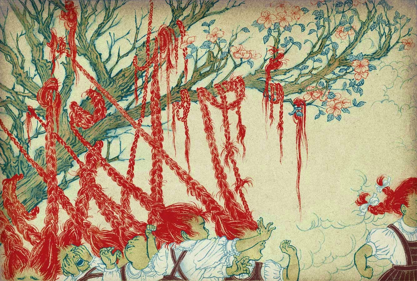
Hair tree by Yuko Shimizu

(More about ink in my next blog post. To be continued....)

Wednesday, October 8, 2014

In Pursuit of Cuteness


I came across Lynne Chapman's video on "How to Create Animal Characters for a Picture Book", where she advised moving and exaggerating facial features to make the characters look cute. So I thought I'd try bumping the cuteness factor up on my animal characters. But how exactly does one define cuteness, in drawing terms?

Below are my attempts at sketching "cute" animal characters. I asked my 8 year old if she liked any characters in the first sketch and she frankly said she only liked the hippo. Personally, I thought the blue pig with the orange short was cute (and cool). The hippo being my last pick as it's nearly cross-eyed for one. But she stood firm on her choice. Hippo. Maybe it was the big eyes?

So on my second sketch, I drew the eyes bigger and rounder and asked her again. She liked the bear and the rabbit but not the cat. I asked her why. "Well, they're just cute", she replied dismissively. Well, the kitty is cute too, I whined.

Sadly, the whole concept of cuteness still eludes me. How exactly do we determine something to be cute? Smaller size? Bigger eyes? Wider faces? Smaller faces? Softer colors? Fluffier attributes? Or all of the above? and much more? I guess I'd have to keep sketching to find out.


More about Lynne Chapman: According to her blog profile, Lynne is based in UK and have illustrated 30 books. Although I'm not familiar with her work, she seems to be a prolific illustrator and is good at teaching and sharing her craft. I find her youtube videos very helpful. Below are links to her blog and her youtube video on creating animal characters for picture books.

http://lynnechapman.blogspot.ca/
https://www.youtube.com/watch?v=NN3J_jKTLxQ


Sunday, September 28, 2014

Boy Reading


The change in season always brings a change in routine. Clothing gets slightly heavier, food staples turn from zucchinis to squash and cabbages and things feel quieter for some reason. It's a slowing down from all the rush in summer. I welcome the chilly fall wind and the light rains. It is a great season for reflection.

Back to school days took some getting use to, with schedules filling up with (Julia's) homework, violin lessons, comic drawing classes and swimming. However, after a couple of weeks' adjustment, I'm now able slowly get back to my drawing and blogging routine again. This week, I have limited my medium to the lowly pencil. Unlike my previous pencil sketches, I've purposely kept the lines soft and light on this one. More feathery and no hard outlines. I liked the feel of the result and also liked the texture of the pencil showing. I think the style matches the mood of the subject. The boy seemed quite peaceful enough, reading his favorite book. I also like it in black and white.


Still, I couldn't help but play around with Photoshop. Adding colors in so I could do my favorite thing in "painting" - putting in the light source. :) This was a fun exercise. I think the pencil outline on the boy and the digital outline on the lamp didn't clash too much. It made it more interesting even.


Monday, September 8, 2014

Video Inspiration: Oliver Jeffers


This week's blogpost follows my thoughts last week on the importance of doing sketches as a tool in fleshing out ideas. I keep reminding myself this as I often underestimate my own sketches and also think that it is way much faster (and more natural) to immediately go to painting the final work.

Here are two videos of Oliver Jeffers, sharing his passion and process in writing and illustrating stories for children. They are quite inspiring.

The videos also show that being a great author and illustrator is more than about having good writing or illustration skills. Great storytellers (either by word or drawings)  have powerful personalities, they have a very unique way of seeing the world, they have an awesome sense of humour and an inherently strong sense of wonder about all things. Being an author/illustrator is never about publishing a book (or getting famous or earning as much as JK Rowling), it is about telling the stories we are born to tell.


Oliver Jeffers

http://www.youtube.com/watch?v=w-8ydwV45no

https://www.youtube.com/watch?v=o2rm6vrJw3A


Sunday, August 31, 2014

Sketch of Julia Reading


In writing class, the initial exercises included writing about oneself - about my experience in school, about an embarrassing moment, a learning moment, a turning point in my life and so on. The premise was that whether we write fiction or non-fiction, it is best (and probably the easiest) to write about what we know. It felt to me like an "inside going outwards" activity.

In contrast, when I took summer art classes back in highschool, the very first drawing exercises were to draw objects or figures. "Pay attention to the light, the shape, the texture," our art teacher would tell us. Drawing/painting still-life or landscapes was about developing how one sees the outside world and expressing it on the page. It felt like an "outside going inwards" process.

Now that I'm doing both writing and illustration, I am struck by this difference in learning approach. I do think that this contrast only applies at the early stages of learning because for established writers and illustrators, I suspect, the process becomes a cycle of outside going in and inside going out. Both writers and illustrators take in inspiration from the world around them and both also express themselves into their writing and illustrations. The process of creativity is cyclical in nature. At least it feels that way to me.

In the past weeks where I have committed myself to drawing at least once a week, I acquired a higher appreciation of the sketching process. I now regard it as a necessary step instead of just another way of doodling. It has become an important part of my creative process.

For me, there are two steps - sketching and then the actual painting/drawing. The two requires different ways of thinking (or being). In sketching, the focus is in the formation of the idea and the transformation of that thought into something tangible and visible. That in itself is a very powerful creative step. To be able to extract an emotion, a memory, a thought and translate that on paper and then have that resulting image convey a similar emotion, memory or thought to whoever sees that image, is challenging. We are essentially giving birth to something invisible, into something that is of this world - tangible and concrete.

Once the idea had been sketched, the next step is to further express and distill it in the style of the artist. The focus then shifts towards technique, skill, medium and style. Both parts present their own challenges and I see a lot of artists who are good in either one of them. But for sure, the illustrators that I truly admire are great at both.

My sketch below was inspired by watching my eight year old struggle to read. As I watched her, I thought about all the stories I read when I was a child myself, all of which I wanted her to discover (as soon as possible, if I had it my way). But I know she had to discover them at her own pace, slowly moving from word to word. In the meantime, the creatures and characters from the great stories that have ever been written are waiting patiently, with much anticipation, for that moment when she finally meets them in their world, that hidden world that can only be glimpsed at when she opens their book and reads.

I plan to paint this in gouache in the coming weeks. Colors and characters would likely change but the idea would be the same.

Julia Reading


Tuesday, August 26, 2014

Bat Sketches in Gouache


Occasionally, I just want to draw the same thing over and over again. Like this one.


Sunday, August 17, 2014

Book Cover Illustration: "Prove It, Josh"

Jenny Watson, a good friend of mine and co-member of the Victoria children's writing group, had released her first book September of last year titled, "Prove it, Josh". The book was published by Sononis for young readers ages 8-12. More details could be found here:
http://www.sononis.com/our-books?page=shop.product_details&flypage=flypage.tpl&product_id=157&category_id=2
Not only is the book quite inspiring, it also nicely captures the struggles of a young kid who is dyslexic (among other things). I also liked that the book is set in British Columbia, involves sailing and gives a glimpse of life near/on the water. I highly recommend her book. Jenny is a great writer. She is an inspiration to all of us who know her. Jenny's blog and tumblr account could be found in the links below. (She posts very nice pictures).
http://www.jennywatson.ca/
http://jenny-watson.tumblr.com/

My illustration this week is of her book cover. Her book cover uses an actual photo of a boy on a sailing boat. She wanted to have an illustrated version, with hard edges and waves similar to the waves in Japanese paintings. I found this to be a great exercise. It got me browsing at books covers for middle grade readers and was amazed to find them mostly awesomely illustrated, have attractive color palettes and packed with high action. I realized, doing book covers is one whole market segment for illustrations in a way and some artists specialize in this area. Quite interesting.

Below are my initial sketches and the resulting illustration. I used brush and ink for the base drawing to produce the hard edge and colored it in Photoshop.

Jenny Watson's "Prove it, Josh" book (published by Sononis, Sept. 2013)
My initial watercolor sketches
Inked Drawing
"Prove It, Josh" illustration 

Wednesday, August 13, 2014

Digital sketching and coloring (collaboration with Julia)

I have been out of my usual orbit the past week, mostly associated with the fact that I had my driving test yesterday and needed to cram review the two driver's guidebook during the weekend. I am glad to say that I have passed the test and now have my Canadian drivers license. Yay! So now, after a day of decompressing, I'm slowly able to get back to my weekly routine.

I haven't got much to show but I'll share what I've just done today anyway. This is in collaboration with my 8 year old (Julia). Last week she made quick sketches of knights that blew me away. I don't know where she got the idea but she came out of her room with her drawing (below) and I just swooned over it. She had accurately depicted the knight's movements, the action, and impression with just a few quick lines. Her drawings were very fluid and simple. It amazed me how children could boil down the complicated details that adults sweat over most of the time into it's simplest forms and still retain the accuracy of the character they are portraying.

Julia's knight pencil sketches
Since I needed to practice doing digital sketches using the tablet pen anyway, I thought it would be a good idea to see how it'd turn out if I traced her sketches over in photoshop and do some quick coloring. In my earlier digital drawings, I have never traced a pencil sketch. I let the pencil lines show through the artwork. So it'd be good to get some practice making purely digital outlines. 

It took me sometime to tinker with the digital brush. I wanted a brush which is sensitive to the pressure and one that would "grow" wider if I put in more pressure and contract to a thin line at very little pressure. Also, I wanted the brush to have an angular edge and not rounded. I must have spent more time tweaking to get the right brush type that I wanted than on tracing and coloring the sketch itself. But I think, it is well worth the effort. 

Below is the resulting sketch. I wanted to keep it rough and sketchy, coloring outside the lines and finishing it pretty fast. I felt that in my previous illustration, I have been too calculated with my sketching and coloring that I wanted to do quick sketches like these for the sole purpose of loosening myself up. I wanted it to have a "cartoony" feel, like it's done by a kid instead of an adult (because the pencil sketch was done by a kid :). All in all, it was a good digital sketch exercise, quite fun to do in a span of thirty minutes. Next time, I would like to explore adding in more textures though. This one feels too 2 dimensional for me. Having some textures underneath would make it more interesting.
I'm still undecided on whether having the pencil outline is better than the digital brush outline or not.
It seems I like both. 

Digital sketch and color study of Julia's drawing

Monday, August 4, 2014

Feature Illustrator: Benjamin Chaud

Every time I go to the library or bookstore and scan the illustrations of children's books, I find myself gravitating towards the works of UK and French illustrators. It made me wonder why. There's definitely a look and feel to their illustrations that is more fluid, more organic and endearing to me. The works of Benjamin Chaud is an example.

Benjamin Chaud (Illustrator)
A quick web search shows him to be  French illustrator who studied in Paris and is now based in Marseille. 
He is an award-winning author and illustrator of more than 60 books which includes The Pomelo series, The Bear's Song and I Didn't Do My Homework Because. There's not a lot of information about him on the web but there are snippets of interviews with him (in French) and he maintains a facebook account. (Links below)

His illustrations are quite colorful and dynamic. I love that he uses pencil for the outlines and colors them digitally. His color palette is limited but are bright and very attractive. Below are examples of his pencil sketches with digital coloring, taken from his facebook account. So rich in detail!


The below two images are some of my favorites taken from his book, The Bear Song. More about it here:
http://blaine.org/sevenimpossiblethings/?p=2625


His work is a great example of the pencil + digital technique. After seeing them, one cannot underestimate the power of the lowly pencil again. Here is a delightful short video using the illustrations of his new book. Pretty inspiring!   http://vimeo.com/101277400

Saturday, July 26, 2014

By the Campfire 2

This is the continuation of my blogpost last week. I'm coloring the pencil sketch drawing of the forest critters by the campfire using Photoshop and a Wacom Intous pen/tablet. Below I started playing around with the colors I had in mind. At first I didn't want the colors to be too bright because it was night time and colors wouldn't be as bright as when its daytime. However, I ended up making it brighter later because it felt flat and uninteresting.


On this next screenshot, I've brightened up my colors and added some bit of shadows. The nice thing about Photoshop is that its easy to change colors and it's also easy to get the darker or lighter tone of the same color. I found the background behind the trees too bright and lacking in texture. So in the next screenshot, I had darkened the background and used textured brushes as well.


I then added darker shadows and the yellow fire. Now it's starting to feel warm and cozy. I must say, my favorite parts are the bluish green plant at the lower right and the daisies beside it. They both came out much nicer than I had expected. I like the effect of the pencil shading on those areas. I should do a lot more of my tonal values when I do my pencil sketch and not just rely on the digital coloring. The pencil shading gives it a lot more texture.


I thought the scene was too serene and "clean", the wind is probably not blowing much too, so I added in the fireflies. Nothing like bugs to make the night by the campfire feel magical and real. I love the effect the fireflies created.


This is officially my first digital painting using Photoshop. It definitely was a different experience compared to using the traditional paints. There were times when I terribly missed the texture created by real brushes and paints. The layers feature of Photoshop is quite powerful. I could turn the whole painting to a much darker night scene by just placing a bluish layer over the entire thing. I also like the fact that one could combine both traditional drawing and digital painting in creating the image. It is quite a powerful technique.

Sunday, July 20, 2014

By The Campfire

It dawned on me the other night that I had something established illustrators (the state that I desire) may not have and that I currently have - the freedom to illustrate whatever I want. If I was a commercial illustrator now or if I was making a living doing illustration work, my illustrations would be dictated by what my customers need, which may not be totally aligned with what I would want to illustrate (e.g., I may want to draw dragons and the customer wants an illustration of a bowl of soup). This thought made me quite thankful and I therefore proceeded to bask in my recently realized freedom (which I had all along).

I asked myself, "So, what scenes or images do you really want to illustrate?" This is an important exercise, the figuring out of one's self and one's inclinations because illustration is not just about technique or about process or about how well one executes his/her idea, first and foremost, I believe the important thing is the creation of the idea or concept itself and then only after that, all other things follow. This then led to my second realization - being an illustrator is not just about skill, it also has a lot to do with what goes on within, our mindset, our thoughts, our emotions, our passion, our beliefs and so much more. It is almost like a journey, as one moves from one illustration into another, one discovers more about herself that she hadn't realized before. The resulting image shows how the illustrator sees the world...that comes with the premise that she sees the world first.

As I posed the question of what I wanted to illustrate this week, I found myself going back to the sketch I did a few months ago of forest animals huddled over a campfire. I'm realizing now that I am drawn to images of people/or animals huddled around a fire or the fireplace, the warm light coming out of a window on a cold winter's night, or the yellowish glow of the street lights in a dark foreboding street, or paintings like edward hoppers's lighted coffee shop late in the evening. These images evoke an emotional response from me, a tugging, a yearning for that sense of comfort, security, warmth, peace and contentment that comes when I'm huddled near a fire or when I'm looking into a lighted window, in contrast with the darkness around or the coldness outside.This feeling is probably universal that's why they put the video of a fireplace crackling on TV during Christmas time or why every Merlin TV episode I've ever watched ends with the young Merlin and his old master having a quiet talk in his master's firelit workroom.

I then remembered that there was this image from a favorite book that I had which I've dissected and imagined over and over for countless of times when I was a child. We didn't have bookstores then and I had like 15 books max during my entire childhood, most of which were the small ladybird fairytale books, whose images were also burnt deep into my subconscious by now. Among these though, there was one big book that was my favorite and I have spent countless of hours staring at the illustrations. It's the King Goblin and his Forest Friends by Geraldine Grimm. It is no longer published today but luckily I still have that book with me, carried across continents when I moved around. At the back of the book is the illustration below and I remember as a child, staring at this illustration gave me great comfort. It took my imagination places! Here we are huddled together, having our warm dinner that's cooking in the blazing fire pit out here in the cold forest, under a big shadowy tree with our delicate tea set and fireflies aglow, celebrating all the hardships and excitement we had in the day's journey, victorious. What an ending!
I am quite convinced that this image had influenced my definition of a happy ending, both in fiction and in real life.

Back cover of "King Goblin and his Forest Friends" book. Illustration by Horst Schonwalter.

I didn't remember this image when I made my sketch of forest animals around a campfire below. But now looking at it, the two are similar in some ways. My sketch was done with my daughter's crayola pens.

Illustrating night scenes is challenging for me because with minimum light, the object's colors wouldn't be looking like their actual colors. They would be muted and as the night grows darker, the colors would tend to turn into bluish black. So if I wanted a not so dark night, there would have to be a mix of the actual colors muted with some blues or black, which is challenging. However, what I like about doing night scenes is putting in the highlights. There's no better time in the day to put in the glow of the light than at night (or dusk).
That's why I love night scenes.


I have redrawn the image using pencil on watercolor paper for my full illustration below. I've put in different varieties of plants as foreground and had nearly similar trees as background. It probably has a lot going on right now with all the details but with the addition of color later, the eye would be focused towards the glow of the fire while all other details would be muted. That's the plan, anyway. I hope I'd be able to execute it nicely. I'll be coloring this in photoshop and probably in watercolor or gouache too. We'll see.


Sunday, July 13, 2014

Fox Sketches

I didn't get to sit down and do a full painting this week as planned, owing to summer related fatigue and having a bored 8 year old. However, I did get to experiment with digital drawing using my smart phone, which is about the most convenient gadget nowadays for those who have bad backs and need to draw lying down before going to sleep in 5 minutes or so.

What I ended up with are rough sketches, digitally painted with colors that I had played around with and ready for me to transfer more confidently using my traditional painting medium. I think process-wise, it is convenient to be able to do quick coloring digitally before doing the actual painting. This way, I am not too committed with the colors yet, could change them easily and enjoy the painting process more.

I am drawing foxes lately because I love foxes. If I wrote a story, I'm sure I'll be having at least one fox in it. In the below images, I pencil sketched a realistic drawing of a fox to help me look at what features are essential and what features I can do without. I then drew a small non-realistic head beside it moving towards a more symbolic image. I took a photo of my pencil sketch using my samsung galaxy note phone (I was too tired to use the scanner), and then colored it using the phone as well.  I liked how the pencil lines looked on the blue fox, a bit rough. I used a digital pencil on the orange fox and the leaves outlines, the result had a slightly different feel but I liked it too. I also liked the blue color on the fox although I don't think there are real blue foxes around, what we do have is a popular restaurant here in Victoria called "the blue fox cafe", so "blue foxes" aren't that hard to imagine I suppose.


This next drawing was when I was really sleepy. I just wanted to get the colors in and see how they would look. The left side of the image is darker because I took a quick photo under a lampshade which then showed the shadows on the left side. A clean illustration wasn't necessary on this one. After this drawing, I decided I liked the top fox heads and wanted to explore them further using Photoshop.


Below are the fox heads redrawn and repainted using Photoshop. Here I am experimenting with different types of digital brushes (pencil and ink brushes) on the outlines. I find that I quite prefer pencil-like outlines which are not too well-defined, almost looking like smudges compared to the more defined lines from the ink brush. For me, the rough outlines make the drawing feel more non-digital and raw. What I don't like though is using the digital pen to draw. I find it pretty difficult to control and uncomfortable to be drawing on a pad and looking at the screen (maybe if I had a Cintiq, it would be better?). I used primary and secondary colors for this one.


Ahhh, so there you go. I got to practice working digitally and explored ways to achieve some sort of non-digital feel to my digital drawings. Not too bad for two night's work. Now I can go back to the comforts of my ink and watercolors and leave my digital explorations for another day. 

Fox design for my printed contact card

Saturday, July 5, 2014

Taking Colors Seriously


I have been thinking about colors a lot lately. I tend to use colors instinctively, on the fly, using either those that are closest to the actual colors of the subject or colors that I like - bright yellows, magenta and cerulean blue. This strategy often ends up being a hit and miss...more miss than hit that is, with me ending up agonizing over it while I paint and then after I paint.

So I thought I'd make my life easier and give it some serious thought before I even touch the paint. Personally, this takes a lot of self-control on my part, as it is always sooo tempting to take the brush and start painting once the sketch is done. Go with the flow. That's how I like it. I love watching how the plain sketches come to life when I add the colors in. It is one of the best parts of painting! That is before I choose one "unsuitable" color and end up ruining the entire watercolor painting.
I guess it's easier to correct color mistakes nowadays with Photoshop or other digital software but its not the same. I still know I made a mistake and the original painting shows it.

Looking at the works of established illustrators, I realized I should be giving my choice of colors some serious thought. It is one of those things that significantly define an artist's work, I believe. Some of  my favorite illustrators even limit most or even all of their works within a specific range of colors. While I'm far from defining myself to a specific color palette, I should at least begin to study how to make harmonious color combinations.

To help me with this, I bought myself a pocket color wheel chart.These are what I know about color wheels so far:
- It helps me figure out what colors to mix to produce the colors I want.
- To make a shadow color of a main color, I need to mix the complimentary of that color and it is easier to
  figure out by looking at the opposite of that color in the color wheel.
- To make a lighter color of the main color, I need to mix the lighter color beside the main color plus white.

I found watching these basic video tutorials quite helpful in understanding the fundamentals. Apparently, there are a whole lot of video tutorials out there that delve into this subject more thoroughly.

https://www.youtube.com/watch?v=WYZWDEmLR90
https://www.youtube.com/watch?v=mkhkZvJ-dzY

So for my first try, I'm sticking on variations of the primary colors. I must say, by just planning my colors beforehand, it makes my painting life a lot more enjoyable. As an extra study exercise, I'm looking at illustrations and then figuring what combinations they are in the color wheel. I learn new things every day.


Hummingbird in Gouache

We met Mr. Crabby here on our recent vacation in Parksville, B.C.
And I must say, we all had a great time chasing him around. :)
Bonjour, Mr. Crabby!  (rendered in ink and digitally colored on smartphone)

Saturday, June 28, 2014

Feature Illustrator: Marc Boutavant

Marc Boutavant (award-winning author and illustrator)

I first found out about Marc Boutavant through his graphic/comic book, "Ariol", which Julia (my eight year old) pulled out from the library's book shelf. I find his illustration style refreshing, delightful and unique. He has created a whole world of believable (and cute) characters which are lively and expressive, and very distinctly rendered in his illustration style. His ideas for unique characters appear to be endless.

I absolutely love his colors - bright and attractive but not too distracting and overwhelming. They say he mainly uses Photoshop and works on a graphic tablet, quite amazing given the excellent texture and fluidity of his line work. His illustrations are seemingly simple but are actually complex, in my opinion. He is one of the illustrators whose work I really admire. Attending one of his workshops is definitely in my dreamlist.


His agent's website has this to say about him:

"Originating from Burgundy (as do the best snails in France - according to Marc), he now lives and works in Paris. WIth his appreciation of the finer things in life, he has often been described as the archetypal French man (even by French people).

His work springs from a wry observation of life and the interaction of his friends and children. Their quirks of personality, mannerisms and reactions to situations are transported onto his characters. These are creatures with a full gamut of emotions. The adventures they share become the narrative tableau for this cast of companions. With so much activity in every corner, each scenario felt and imagined in detail, light hearted horror, comedy and pathos combine to form a rich narrative." 

Here are more images of his work:


His books are mostly in French and English. His popular English books include Around the World with Mouk, Ariol series and Just for One Day. Both Mouk and Ariol have been adapted into animated tv series. His most recent book titled, "Ghosts" is written by Sonia Goldie.


He is represented by Heart Agency. Click here for more images:  http://www.heartagency.com/artist/MarcBoutavant/gallery/1